

Primary Play is set to be a breakthrough trend within the interior space this year, as homeowners look to bring fun, nostalgia, and individuality into their homes.
“Characterised by bold, monochromatic primary colours, geometric patterns, hand-painted features, and playful shapes, this interior trend infuses personality to create uplifting and unique environments that each tell their own story.”, explains Lena Gierasinska, Head of Product and Displays at Barker and Stonehouse.
The trend comes as Pinterest reports a 45% uplift in searches for cupboard painting and a 135% increase for hand-painted furniture. Whilst the trend exuberates expression and fun, Lena warns that certain elements of this trend require thought and precaution before incorporating into your home.
She warns, “The DIY nature of this trend means that a lot of preparation and research is needed to ensure you don’t damage your high-quality furniture.”
Lena shares her advice when incorporating the Primary Play trend into your home.
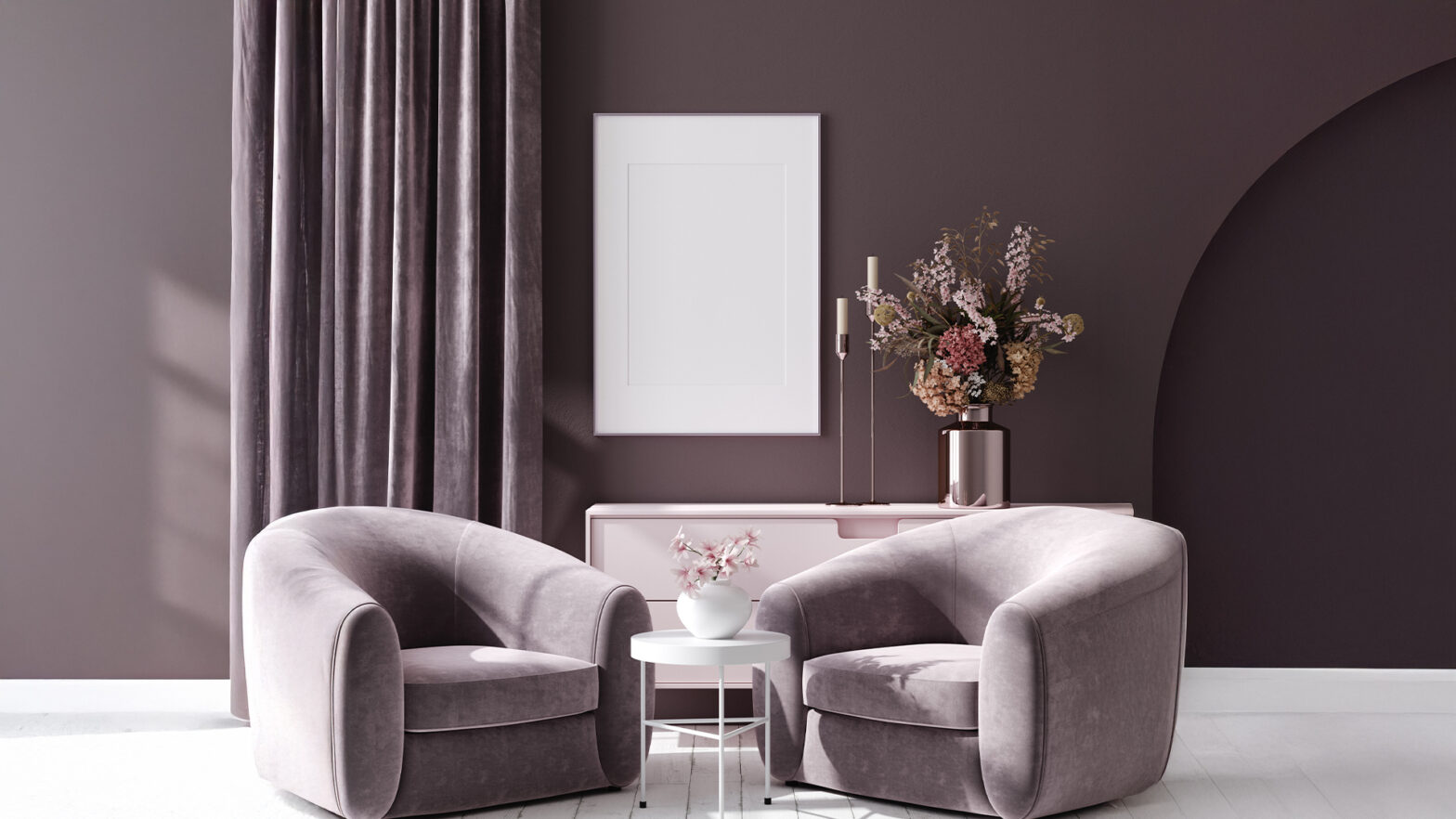
Playful shapes.
Curved furniture, asymmetrical décor, and oversized accessories inject a sense of playfulness and personality into interiors. From crescent-shaped sofas and chairs to free-form tabletops, curves are calming and create a sense of comfort and softness.
However, Lena explains that balance is key and too much of one design element can leave a space feeling monotonous or visually unbalanced.
“A well-designed room achieves equilibrium by carefully layering contrasting elements. Think vintage with contemporary, dark with light, and structured with free-form. To make the most of curved silhouettes, pair them with clean lines and sharper edges for a refined yet playful aesthetic that feels both timeless and full of character.”, she shares.
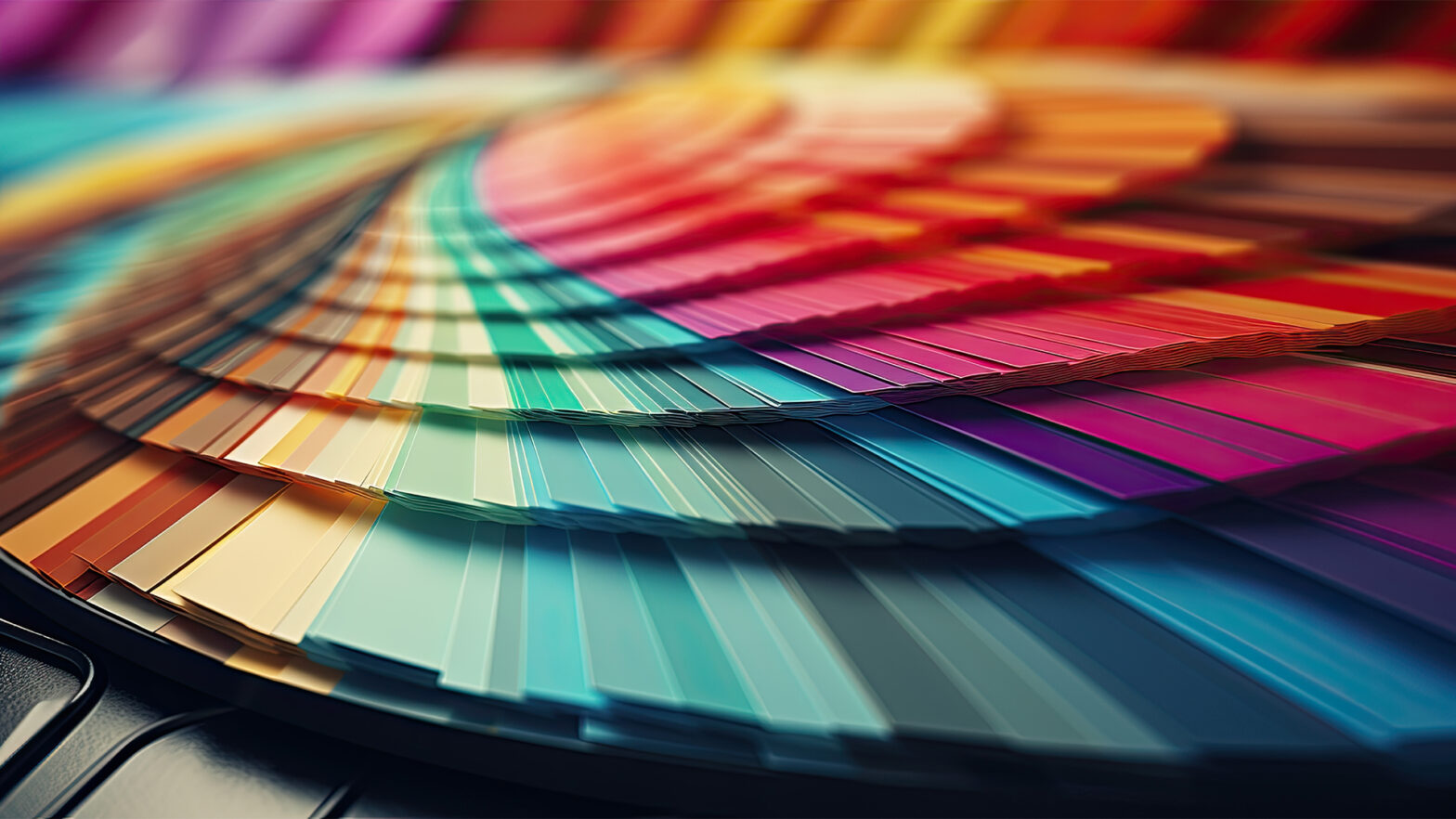
Colour blocking.
Colour blocking is a bold and dynamic design choice, but balance is key to making it work beautifully in a home.
Lena explains, “While primary colours, red, yellow, and blue, form the foundation of colour theory and naturally complement one another, large expanses of these vivid hues side by side can feel overwhelming.
To create a more refined and harmonious look, I recommend grounding these bold shades with warm neutrals and natural wood finishes. This not only softens the contrast but also adds warmth and sophistication, ensuring the space feels intentional rather than overpowering.
For a beautifully balanced interior, consider the 80-20 colour rule. This approach sees 80% of the space dressed in soft, neutral tones. The remaining 20% is where you introduce bold accent colours through statement furniture, playful patterns, tactile fabrics, or striking décor. This contrast adds depth and character without overwhelming the space, striking the perfect harmony between subtle sophistication and vibrant personality.”
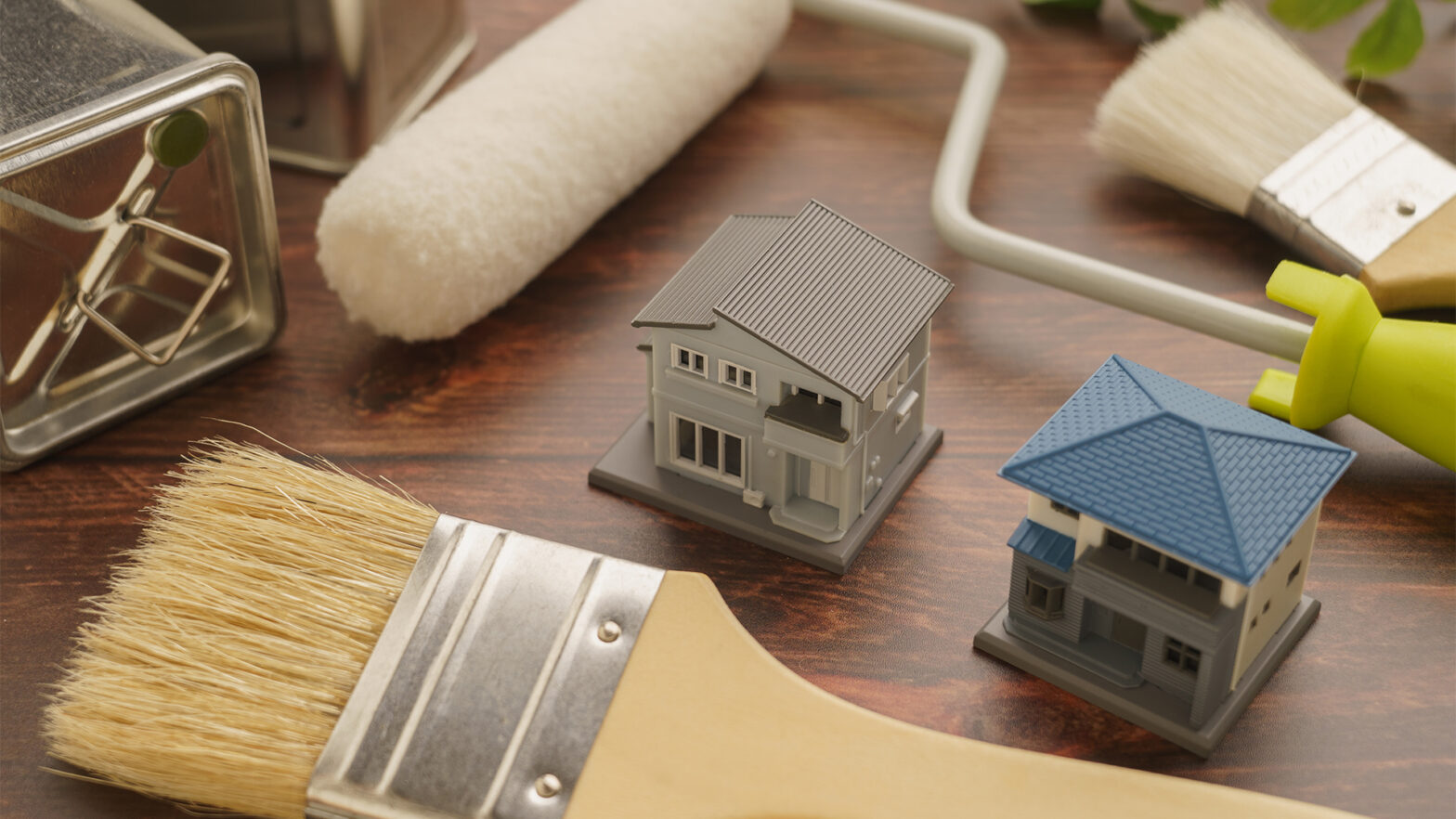
Hand-painted furniture.
Hand-painted designs are a fantastic way to infuse personality into furniture, turning everyday pieces into bespoke statement items. Whether it’s abstract motifs or whimsical, storybook-inspired patterns, this DIY-friendly approach breathes new life into old furniture while allowing homeowners to showcase their creativity.
However, Lena warns that proper preparation is key to achieving a polished, long-lasting finish and avoid permanent damage.
She explains, “Different materials require specific cleaning products and primers, making this step crucial for ensuring durability. Sanding is essential for removing gloss and helping paint adhere, but when it comes to finishing, high-gloss surfaces can reveal fine scratches over time. To maintain a flawless look, avoid silicone or wax-based polishes that leave residue, and opt for a high-quality, wax-free furniture polish recommended by the manufacturer.”
Alternatively, she suggests upholstering using bold, playful patterns. “Stripes are a trend we will see continue into 2025 that can instantly create fun, visual interest within a room. Use multi-coloured stripes for a maximalist look or tone down your primary colours with a contrasting white stripe for a more minimalist interior that still feels playful.”
Whilst the Primary Play trend is expressive and free, the key to incorporating the trend is focusing on balance and care to create a fun, yet visually cohesive space with quality furniture that lasts.