Selling Sunset Season 4 is set to hit our screens in late 2021, and if the last three seasons are anything to go by, it’s going to be as explosive as ever.
Yes, we’re partly watching to see the drama unfold, but it’s not the only reason we’re hooked; we love getting a sneak peek into the sprawling contemporary properties of LA, and imagining what we’d buy if we won the lottery….
Sadly, most of us won’t be dropping millions of pounds on a property anytime soon, so Stelrad, interior design experts, have put together their top tips to turn your current home into a Selling Sunset- style haven:
Neutral decor:
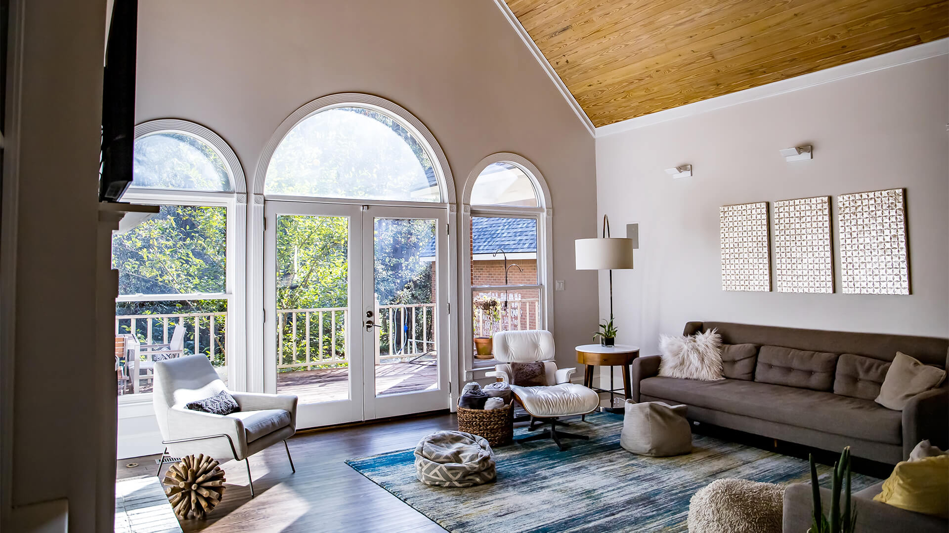
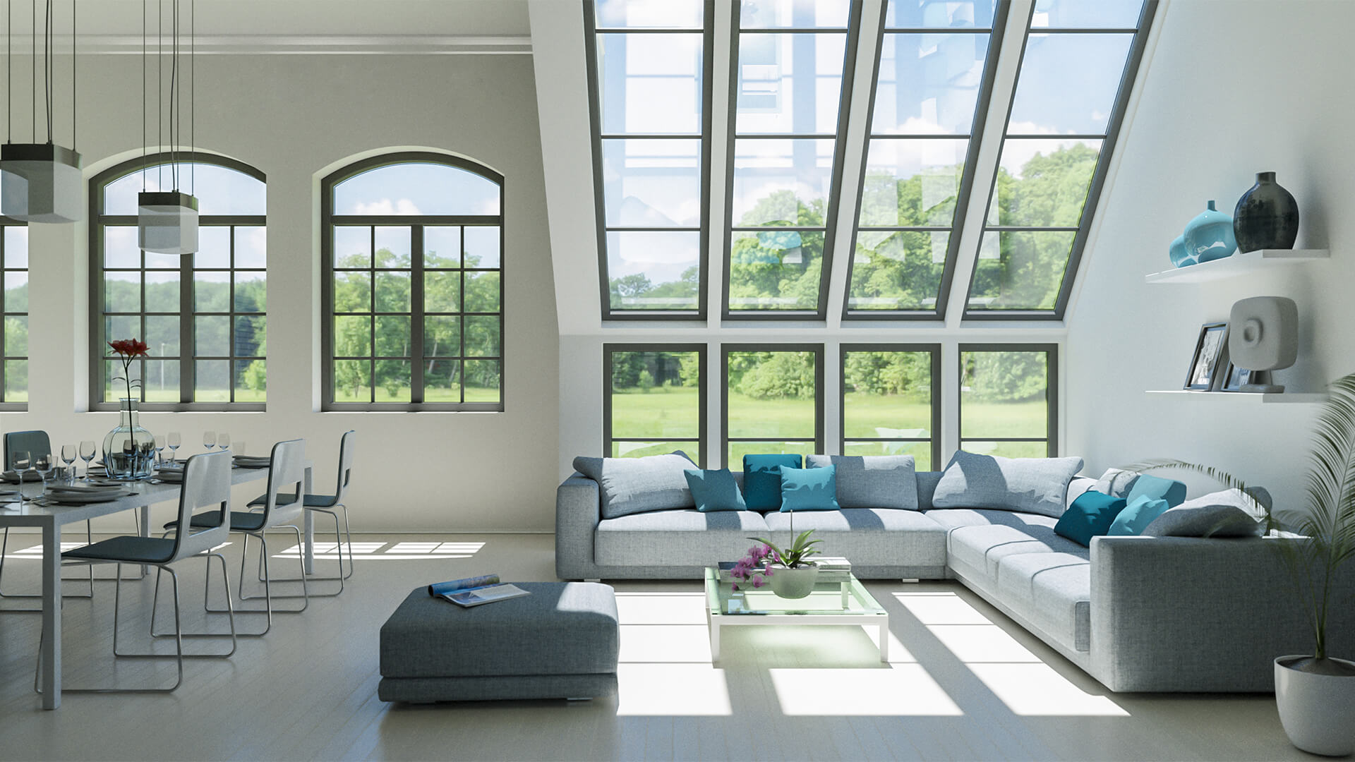
An elegant mix of pear white, elephant grey and pale wood is the combination most Beverley Hills homeowners seem to want. For a low-budget, Selling-Sunset style upgrade, simply give your walls a fresh lick of paint. If you have more to spend, re-doing the floor in pale wood will give your home a modern look that Christine Quinn would be proud of.
In one episode, the Oppenheim realtors organise a $40,000 (£30,253) mini-makeover for a property, involving repainting and repairs, adding $240,000 (£181,520) to the $3.6million (£2.72million) price, showing that a little renovation can go a long way!
Mirrors:
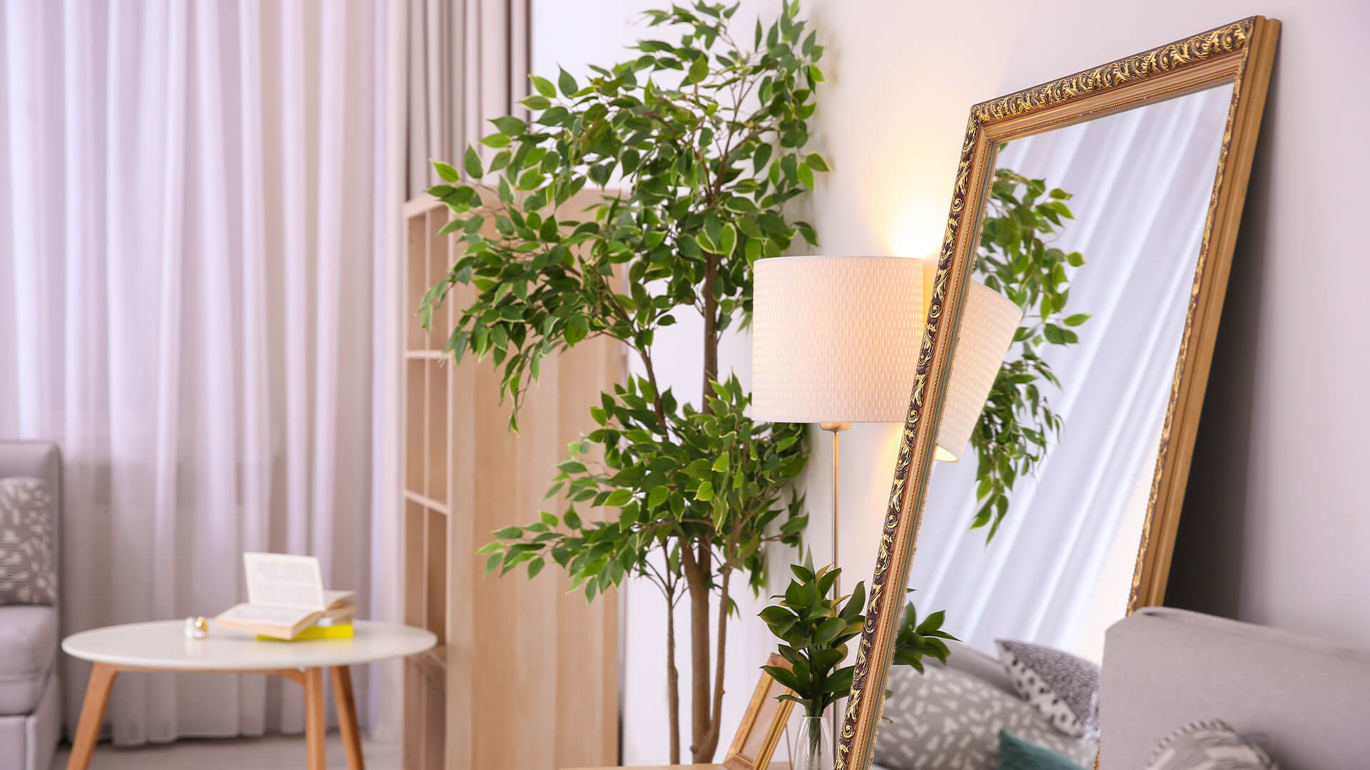
The huge properties in Selling Sunset look large enough without needing to trick the eye, but if you want to give your property an extra few metres, mirrors are your new best friend.
Floor-to-ceiling mirrors can give the illusion of high ceilings if placed in the correct position. Not to mention, tall and slender mirrors can actually create a multitude of optical illusions by mimicking a narrow hallway, which will make your room look even bigger.
Placing a big mirror in dining areas is a tip most interior designers swear by, which means a mirror near your dining table will also make your house look expensive and well-decorated at the same time.
Lighting:
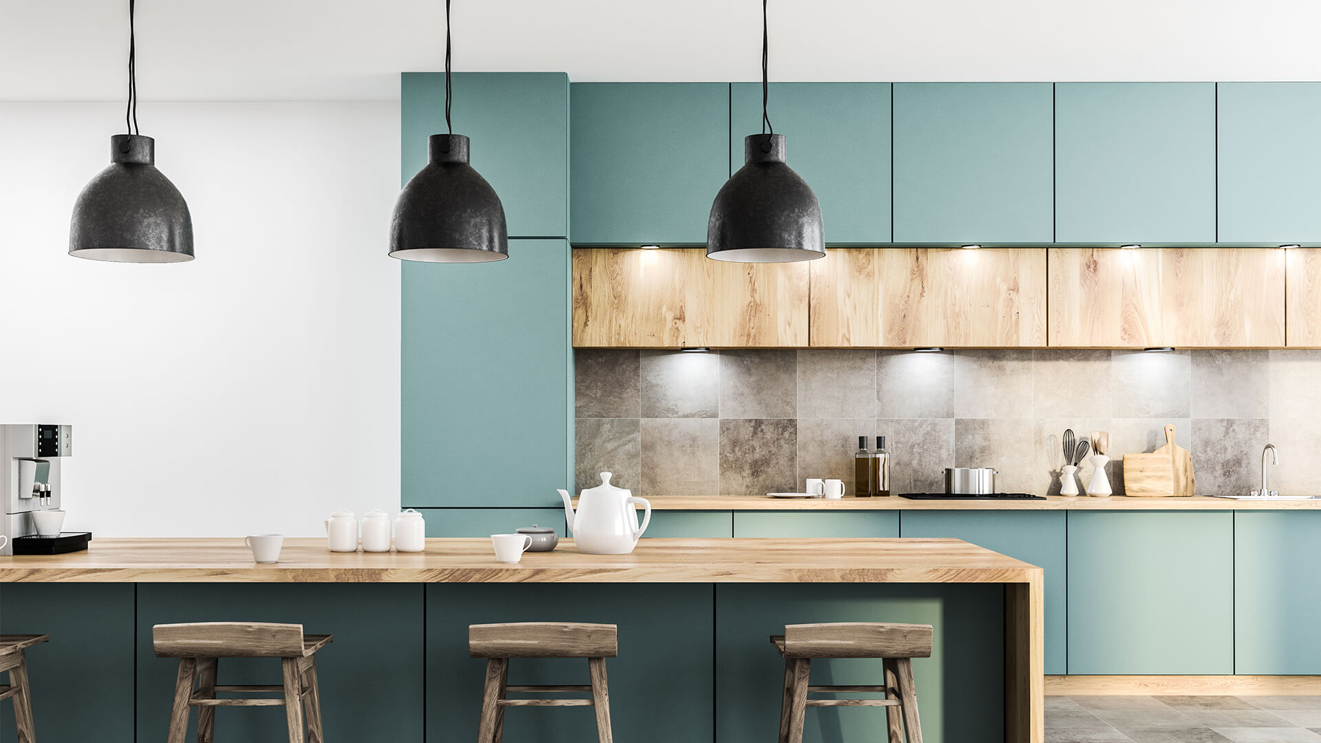
Bring some Selling Sunset bling to your house with a lighting upgrade; large modern chandeliers or triple pendant lights work well in dining areas or above kitchen islands, whereas spotlighting works well in bedrooms.
Patio Doors:
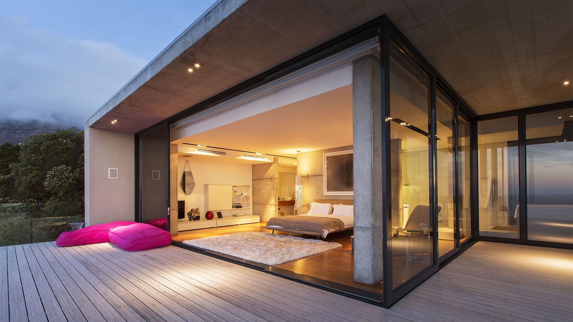
If you’re lucky enough to have outdoor space, the doors to this can make your property look seriously streamlined and Selling Sunset-esque, if you choose wisely. Choose floor to ceiling if you can, to let as much light in as possible, and avoid thick door frames, as the more window there is, the larger and brighter your home will appear.
Stand-alone bathtubs:
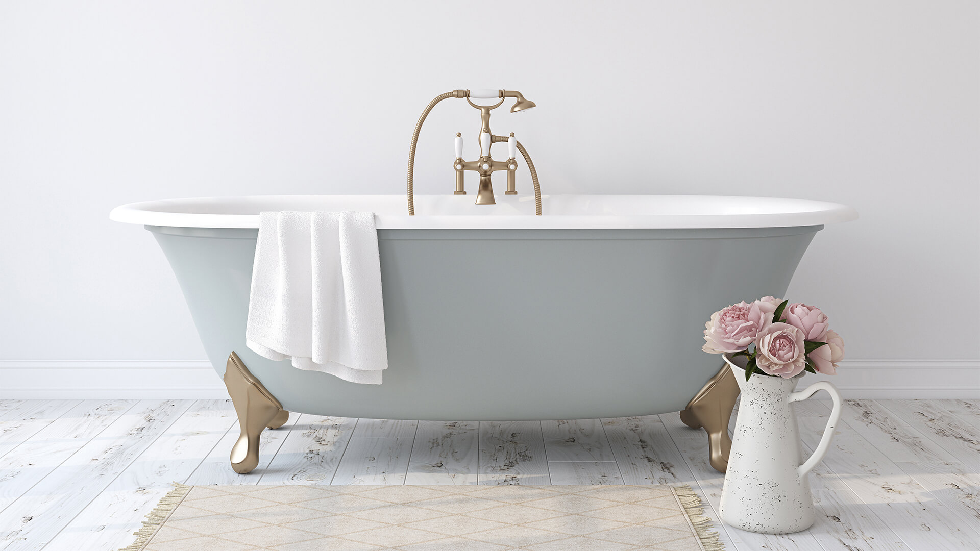
Nothing upgrades a bathroom like a standalone bathtub. They are a popular choice amongst LA homeowners who are looking for expanded design options and flexibility of placement in addition to making a strong style statement. There are many options available on the market but we personally love a simple oval shape.
Japandi Style:
The hybrid design style is big news thanks to elegantly simple looks that work in harmony with our everyday lives, and LA houses are more often than not decked-out the Japandi way.
Japandi is a new, calming fusion of Japanese and Scandi styles that brings out the best elements of each. While Japanese emphasis on minimalism makes it too sleek for some, Scandi‘s perchant for layers and cosiness – or creating ‘hygge’ – brings the balance. Think simple neutral colours, low-key artwork and minimal clutter, with the addition of textured cushions, throws and linen bedspreads.
Electric fires:
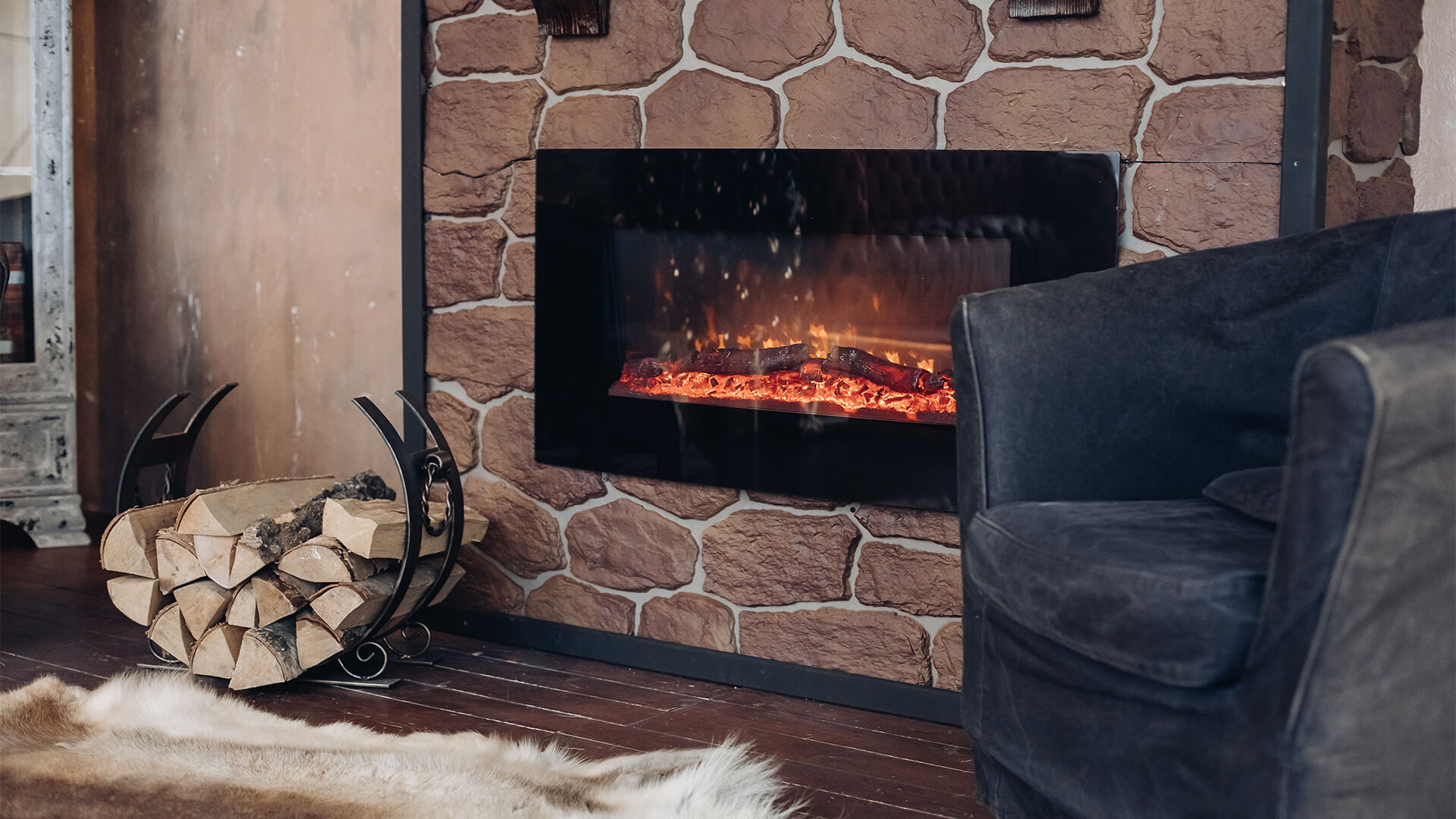
Not an episode goes by without a shot of a roaring electric fire, adding modern brilliance to each and every LA pad. There are a wide range of options to choose from, hence there’s something for every budget. You can install your electric fire into your wall, or for something less permanent, why not purchase a tabletop fireplace?
Hallway decor:
People often forget the hallway when they’re decorating their home, however, in Selling Sunset you’ll often see spectacular hallways. Chris Harvey, interior design expert at Stelrad said:
“Although it’s often an afterthought, the decoration of a hallway is incredibly important – after all, it’s the entrance and first impression people get of your home. You want your hallway to feel bright, airy and large, so I’d suggest a large mirror spanning almost all the way from floor to ceiling; this will give the illusion of high ceilings if placed in the correct position. I also think it’s imperative to have lighting in your hallway – this can be anything from a chandelier to a retro lamp, depending on your personal style. Brightness is welcoming and when people enter your home you want them to feel a sense of welcome and calm. Finally, adding some greenery or colour with a plant or fresh bouquet of flowers placed on a small table in the hallway will add charm and style to what could otherwise be a boring room”.


