Comments from Amy Wilson, an interior designer working with 247 Blinds.
1. Brave Brown
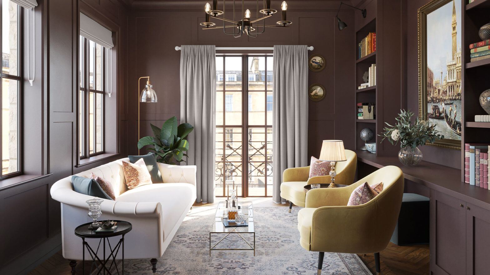
Earthy Tones are likely to continue to dominate into 2025. With Graham & Brown crowning Elderton, a medium brown shade, as their colour of the year for 2025, those who like to be bold with their interiors will love this trend.
Amy comments: “The cosy, natural shades of brown and dark green create a sophisticated and warm base for building texture and layering your home. These colours frame the outdoors and bring the outside in – if it works in nature you can generally assume it can work in your home too.”
“The brave are embracing brown as an alternative darker shade to the usual black. For those who go for it, the result is cocooning, striking and the perfect backdrop to accessorise with your favourite prints. Colour drenching a whole room in a deep chocolate brown will work like a neutral, and allow you to bring in some complementary tones of burgundy, orange or pink.”
Amy adds: “In a living room, add metallics and soft lighting to ensure there are some reflective surfaces to shine in the darker corners.”
“When adding layers to these earthy tones, you can complement the depth of colour with a rich and luxurious velvet – imagine floor length velvet curtains to frame your view outside. Equally, a paler contrasting neutral in a linen effect Roman blind will pair perfectly with dark earthy shades.”
2. Dusty & dusky blues
According to 247 Blinds’ internal sales data, blue fabrics are their best seller of both Roman and Roller blinds, after neutrals and grey tones, with this expected to continue into 2025.
Blues have evolved beyond the dark petrol, blue and black shades we have been familiar with into something more dusty, dusky and even smoky. It is a softer shade of blue but still has impact.
Amy advises: “When used across walls, dusky blues often work well in homes with high ceilings; think Victorian-era terraced houses. The big decision is whether to take the colour up and over the ceiling- a technique called colour drenching.”
“Using dusky blues in living rooms and dining rooms is a perfect choice. The trend for combining blue and green has been seen increasingly in interiors over 2024 and is not showing signs of changing. Ensuring the blue and green have similar dusky, pastel or deep hues will help them complement rather than contrast.”
“Perhaps consider introducing a soft sage green with a dusky cornflower blue for the perfect pairing and add in rattan, bamboo and wicker accessories to this scheme for balance.”
Amy suggests: “For those who are fans of bold interiors, orange is the perfect complementary colour to create visual impact and add vibrance. Opting for orange roller blinds in the windows, or perhaps even injecting through art prints or cushions, will really make your living room sing.”
3. Burgundy and even RED
We have seen that burgundy is having its moment in beauty and fashion trends this autumn/winter, with the colour already starting to make its way into interior design choices.
Pinterest has seen big yearly increases across burgundy-related searches, with “burgundy bedroom” up 700% YoY, as well as “burgundy kitchen” and “burgundy bathroom” both up 200% YoY.
Amy shares: “This surge in burgundy for interiors is a development from the increasing amount of red seen over 2024. Burgundy is like the more mature sister of red and a little easier to work with. It is a huge statement to apply burgundy across your walls so perhaps consider this colour, and the more tricky red, in accessories or smaller soft furnishings.”
“A couple of cushions, a small footstool or even a beautifully upholstered chair in plush velvet fabric is the ideal way to introduce this trend into your home. When opting for burgundy you will be able to create a vintage inspired, rich scheme with a more traditional style – whereas the more red your décor becomes, the more contemporary.”
Amy adds: “Window dressings are another opportunity to bring in this colour in a glamorous way. Opting for Roman blinds is a great place to start, but for those looking to create more drama, consider layering them behind some floor-length curtains for a cascading effect.”
“The rich intensity of burgundy is perfectly paired with deep mahogany tones and deep pinks, but can equally complement a very pale blue for a contemporary take on a mid-century palette. To complete the mid-century scheme, source secondhand or vintage furniture pieces – such as G-Plan coffee tables, sideboards and bookshelves.”
4. Latte tones
Move aside greige, warm neutrals are set to take over in 2025! As people’s love for Scandinavian and bohemian design continues to grow, with Pinterest seeing searches for “Scandi home decor” up 600% YoY and “Boho chic living room” up 175% YoY, the associated colour palette will also continue to dominate interiors.
Amy explains: “A shift away from stark minimalism and a move to more comforting tones has been in motion over the past few years and the days of sterile white or greyscale homes are dwindling.”
“Even people who aren’t fans of colourful homes still feel the desire to add warmth and character to their space, which is why soothing coffee shop tones that ooze charm and timeless appeal are so desirable.”
Amy shares: “Milky browns, soft vanillas and seductive caramels are all shades that fall under the latte tone/coffee shop trend, each one creating its own essence of calm and tranquillity – making this colour palette ideal for any room across the home.”
“Scandinavian design principles are the perfect example of how such tones can work seamlessly as they look to create functional rooms that avoid feeling cold or impersonal – the key here is making sure there is some black.”
Amy comments: “Fully embracing latte tones doesn’t just involve choosing one colour and letting it do all the leg work. By thoughtfully combining and layering multiple warm shades, you can create a curated palette that works in harmony.”
“Using different materials and textures is a great way to add in something black to prevent this palette from looking too limited and demure – think wooden blinds and floorboards, or slubby, woven black fabrics to balance your new favourite neutrals.”


