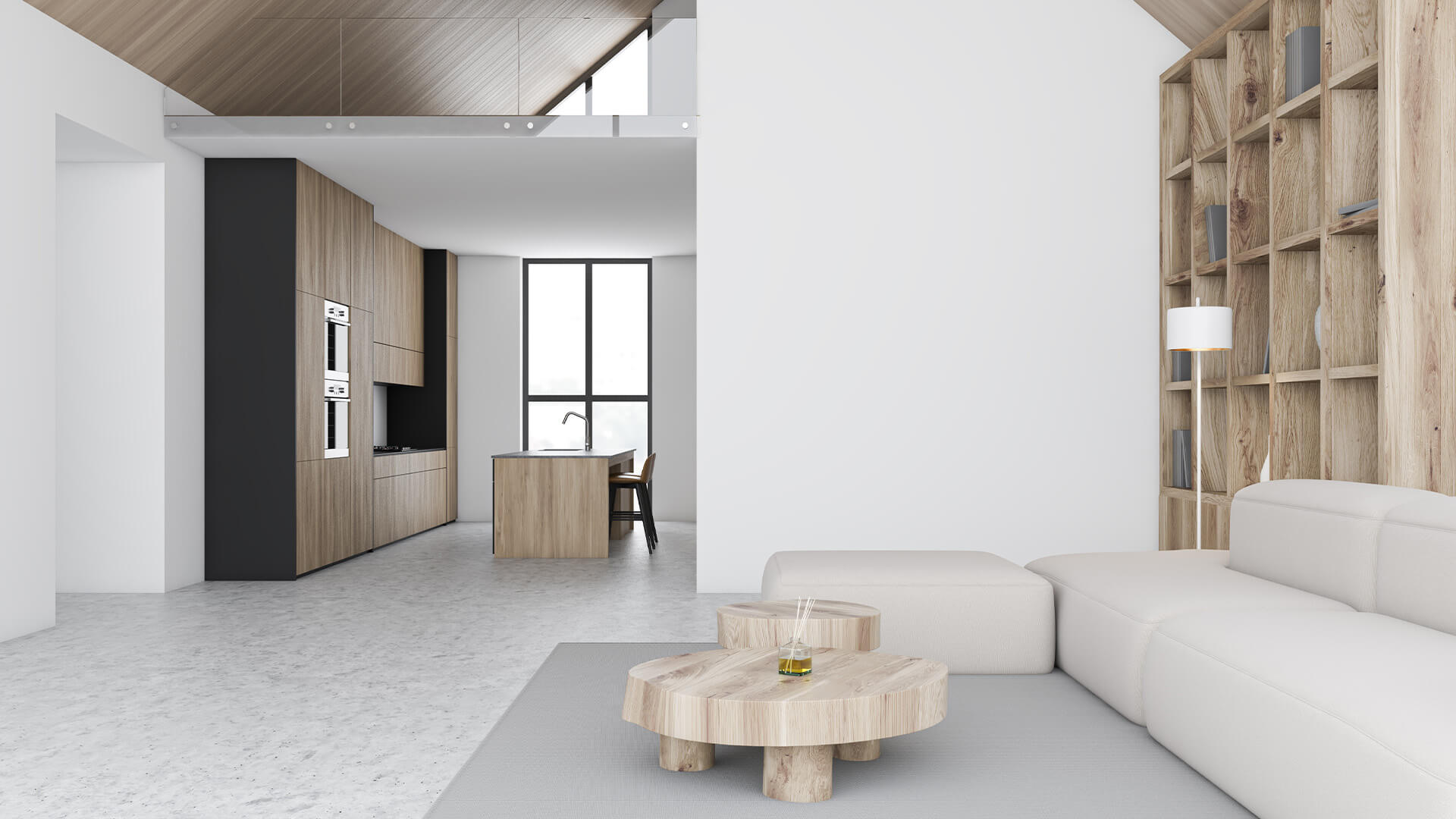
Minimalism has become increasingly popular in recent years, with many utilising the movement as a lifestyle. In architecture, minimalism has become an integral part of contemporary design, with many opting to focus on functionality rather than aesthetic value. As this trend has infested countries around the world, it has disrupted cultural design trends, bringing forth the sanitisation of culture.
Skylines around the world are beginning to look the same. Towers of glass and concrete rise high above the streets below, blurring the sun behind their immense frames. They are soulless. Cold. They serve as a reminder of the postmodern age – minimalistic and streamlined. Filled with offices, luxury apartments, department stores, and boutiques, such buildings stand as a symbol of consumerism and wealth, offering little in aesthetic value bar a sleek and polished appearance. From Dubai to London, and Beijing to Tokyo, buildings like these are appearing everywhere, erasing creativity, culture, and history in exchange for simplicity.
Prior to the Second World War, architectural innovation was thriving. The Art Deco movement, for example, was blossoming in Europe and the United States during the 1920s and 30s, with one of the most famous examples of Art Deco architecture being New York’s Chrysler Building which was completed in 1930. Designed by William Van Alen, the opulent building is topped with a distinctive Art Deco crown and spire. Comprised of Nirosta steel, the crown follows a unique sunburst pattern, interrupted by triangular vaulted windows which are repeated along the terraced crown’s seven setbacks.
However, it is inside the building where Art Deco truly comes to life. The triangular lobby exudes golden-age opulence as etched-glass chandeliers dangle above each stair and a mural spans the ceiling. Transport and Human Endeavour by Edward Trumbull, at the time of its debut, was the largest painting in the world, covering an impressive 78 by 100 feet. Quintessentially Art Deco, the mural boasts golden and ochre tones, sharp angles, chrome ornaments, and of course, triangles.
To this day, the Chrysler Building is synonymous with New York, just as the Eiffel Tower is with Paris and the Taj Mahal with Agra. Simply, architecture defines culture, it highlights eras, attitudes, and hopes. Moreover, in a world of internationalism and globalisation, architecture helps to create and preserve individuality. It is the connection between present day and bygone times, upholding the integrity and fundamental elements that make architectural trends exclusive to different countries. Indeed, as different cultures have different needs and practices, then it is natural that architectural designs reflect these distinctions.
It was during the early 1950s, however, that modernist, brutalist, and minimalist architecture rose to the international stage. United by a lack of ornament and an embrace of the bare essentials, these movements each highlight a post-war movement towards a more relaxed take on life, shifting away from the eccentricity and maximalism of architectures heyday. Perhaps these styles were developed to express happiness and a healthy life without the influence of consumerism; however, as the minimalist movement in particular has spread around the world, so has the loss of culturally-influenced design.
From the visual arts to music, minimalism has made its presence known, with the likes of Eva Hesse, Robert Morris, and Carl Andre becoming the faces of the movement. According to Tate, who run four major galleries, minimalist art embodies a purified form of beauty, potentially representing qualities such as truth, order, simplicity, and harmony. In its own way, minimalist art is avant-garde, defying the norms of artistic convention. Yet within architecture, it could be said that these factors have been lost to economic-effectiveness, optimisation, and capitalism – after all, it is much easier and cost-effective to create a minimalistic structure than one with fine details and extravagant décor.
In the United Kingdom, the phone box is one of the most well-known examples of this mass sanitisation. The mid-1980s saw the rollout of the KX Telephone Box, which replaced the classic, stylistically-superior design of the iconic red telephone box. The red telephone box has such a legacy that it is still used on English and London merchandise and art. In comparison, the contemporary design is exceptionally bland and drab, with a 2001 The Guardian article stating:
‘Since then, BT has done its utmost to turn the phone box from one of the most famous and elegant pieces of street furniture into the most boringly ugly. It might be more vandal proof, more accessible and more modern (in the worst sense of the word) but the KX100, even when feebly capped in a fake Gilbert Scott-style crown, looks plain nasty.’
The consequences of this evolution come in the form of a catastrophic loss of culture, innovation, and art. Functionality and accessibility must be considered in architecture – but these should not replace individuality and aesthetics. Instead, they can live in tandem. Architectural uniformity is plaguing the planet, and with it, it has brought about the end of uniqueness, pomp, and imagination. We must realise that architecture and culture go hand in hand – whether it be the Pantheon in Rome or the Konark Sun Temple in India – as such buildings represent people and connections, hinting at societal ideals and philosophies.
Without these differentiations, we are setting ourselves up for the complete loss of originality and heritage.


