


By Amy Wilson, interior designer at 247 Blinds
Looking to give your home a quick refresh ahead of the spring/summer season? Below, Amy Wilson, interior designer at 247 Blinds, shares her insight on which colours are set to dominate in SS25 and beyond.
Earthy, muted colours as a key theme in 2025
“With Mocha Mousse announced as Pantone’s Colour of the Year, it is no surprise that earthy, muted colour palettes have begun to pick up in popularity, a sophisticated colour drench of browns, heavy creams and more weighty neutrals is a popular choice for homeowners and designers alike and this is set to continue throughout SS25. There is a clear steer away from pale tones – which some may consider as ‘wishy washy’ – moving towards deeper, more dramatic shades such as dark browns and terracotta.
There is still a place for bright and bold colours within this colour palette, but this will be seen more through accessories and window coverings, such as Roman or roller blinds, to create colour ‘pops’ rather than dominating the overall scheme. The bolder colours that are coming through are also richer and warmer, emulating jewel tones such as ruby red, amber and emeralds.”
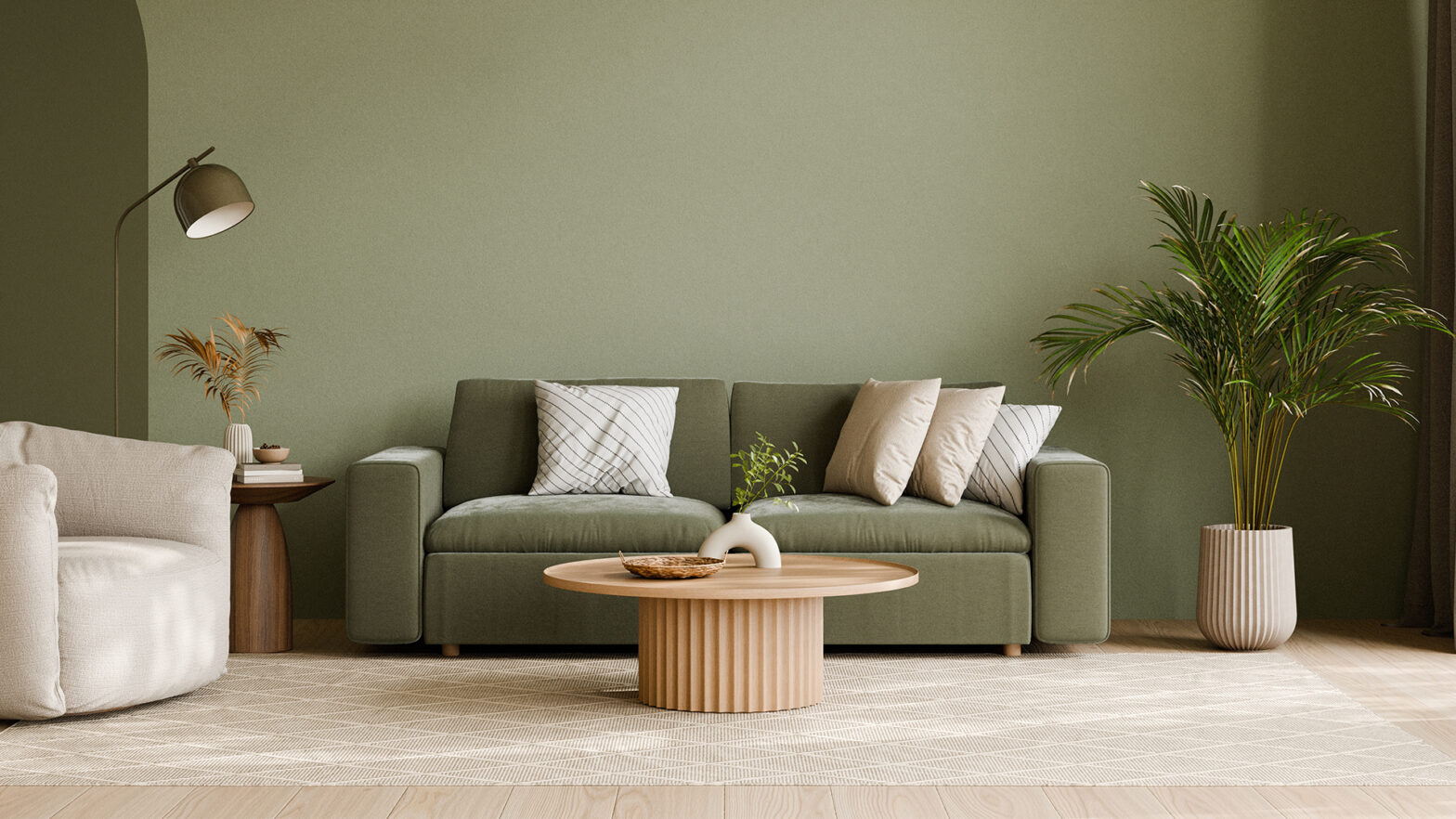
Olive green > Sage green
“Sage has been a popular choice for many in the last few years, almost acting as the natural next step from the classic neutral and monochromatic schemes of minimalism. However, people are becoming braver and more playful with their colour schemes and, as part of this, looking for a more up-to-date green. For some, this will be a subtle change to olive green, which looks great when paired with reds, pinks and cooler-toned neutrals. For those looking for a more dramatic scheme, sage will be replaced with emerald green. This rich, deep and opulent colour is ideal for colour drenching a space, including on the ceiling for added drama and a closely matching window blind or curtain for a cocooning effect.”
Purples
“Purple comes in many shades and tones, with some being easier to incorporate into the home than others. A bold, bright purple when paired with white or grey can look very cold and harsh. To avoid this, lean more towards warmer shades such as aubergine which is closer to black, adding depth to the space. For a cosy, contemporary palette, lead with aubergine and mix with darker neutrals and plenty of texture through soft furnishings for added warmth.
“If bold colours are your preference, match a regal purple with a powerful yellow. This looks particularly effective within period properties with high ceilings. With this decadent colour scheme, you’ll want to keep the pattern to a minimum in the room for a composed and sophisticated finish.”