Whether you’re revamping your interiors, renovating, or updating your indoor-outdoor living spaces such as your garden room, experts at Dowsing & Reynolds have shared 9 common mistakes people make when it comes to lighting our spaces.
From forgetting to work with natural light to not using multiple lamps in one room, Ally Dowsing, interior expert and founder of Dowsing & Reynolds shares her advice:
Forgetting to work with natural light
Ally says: “When it comes to selecting the number and strength of artificial light sources in your space, considering how much natural light the space gets is key – especially if you’re designing an outdoor living space such as a garden room.
“Monitor the space to assess whether your room is north, south, west or east facing as this will help to highlight how much artificial light is needed for the room. Similarly, take note of the size of windows or skylights you have, as if you have a light and airy space, you might find you don’t need your lighting scheme to be as bright.
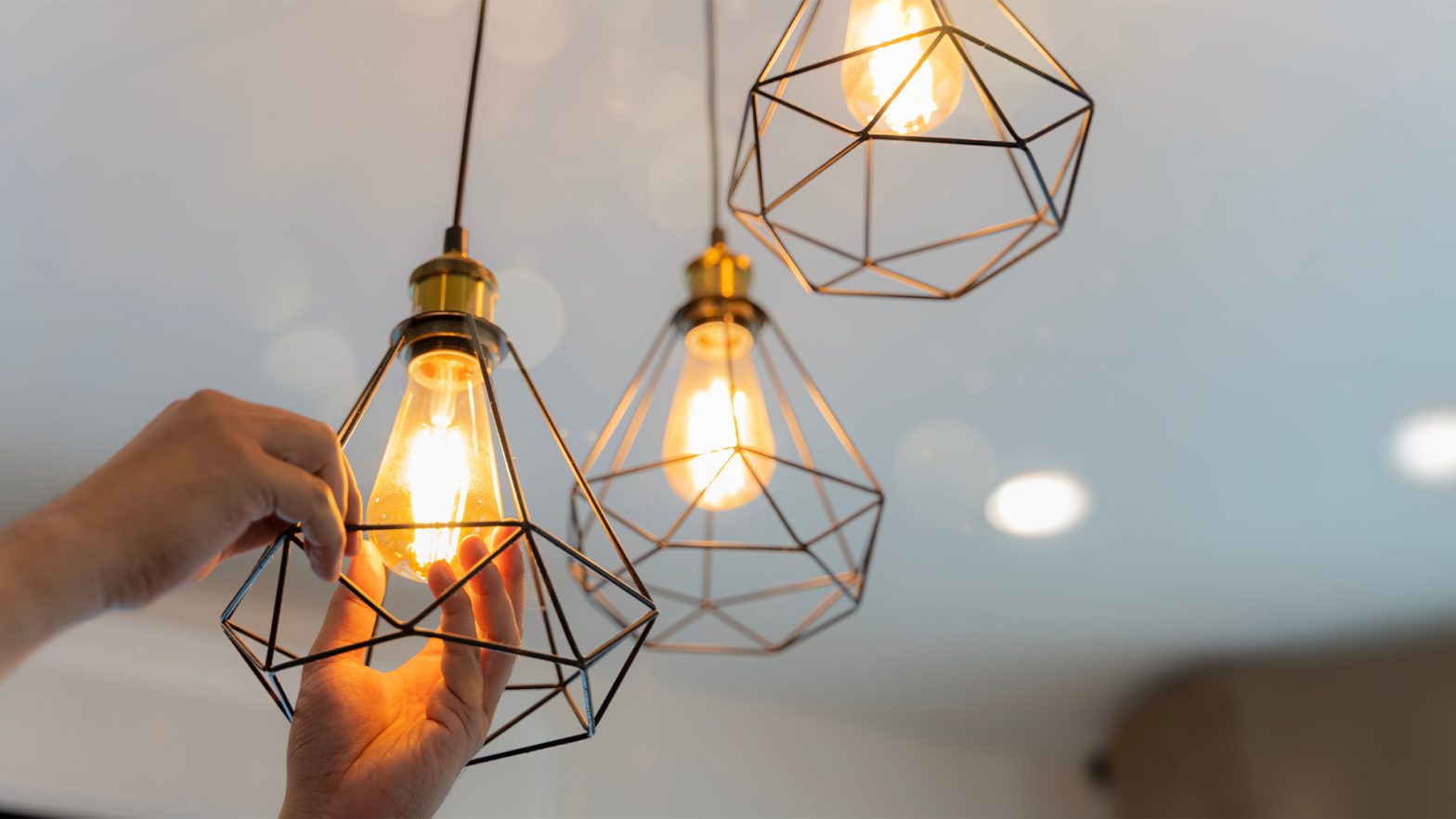
“If you find your kitchen or garden room has lots of bright light, use task lighting such as pendant lights to illuminate the space for activities such as reading or cooking.”
Choosing inappropriate lighting for the space
Ally says: “Often in our home design, we tend to choose lighting without thinking about what’s needed or what will be most functional. Therefore making sure to choose the most appropriate lighting for each room is key.
“While in the bedroom you may want to opt for a warm light to create a soothing atmosphere, areas such as the kitchen counter will require task lighting. Here, choose spotlights to ensure there is enough light for cooking.
“This also goes for outdoor lighting. Make sure there are convenient path lights and porch lights between your home and garden room, to help you in and out safely in the evening.”
Forgetting to think about lighting before you decorate
Ally says: “One mistake commonly made is forgetting to plan your lighting scheme before you renovate or decorate.
“To do this, think about how you want to use the space, mapping out where key pieces of furniture will be placed such as side tables and coffee tables. While this does require extra time and planning, this will help to ensure you have the right switches, wiring and light fixtures in the right places.
“Planning in advance will help you create a layered lighting effect.”
Not using multiple light sources in one room
Ally says: “Ensuring you have a mix of lighting in a room is key, as this will help to bring the room to life. Include a range of task lighting, accent and overhead lights to help the room work for different purposes. From reading, cooking to even napping.
“When it comes to how many light sources to include in your space, it does depend on the size of your room. On average, we recommend a living room to have two to three lamps scattered around the room, but no more than four.
“For example, a lighting scheme with a ceiling light, wall lights and a floor light is a great formula for a well-lit room that can be easily transitioned down for the evening.”
Not thinking of lighting like the sun
Ally says: “Imitate the natural cycle of the sun with your lighting choices, with the aim of your scheme having enough layers that it can become softer and lower by night – just like the sunset.
“Use larger floor lamps and smaller table or bedside lamps to complement ceiling lights, to help transition your space throughout the day.”
Ignoring light and paint pairings
Ally says: “Just like natural light can affect the shade of your painted walls, so can artificial light sources.
“Standard soft white incandescent or LED light bulbs provide warm natural lighting which can make bright shades of paint, such as red and orange, appear slightly more intense. If this is the case, consider opting for this pairing in a dining room or snug, for added cosiness in the evening.
“Standard LED light bulbs can make cooler tones such as blues, green and grey appear a little duller so opting for a slightly more vibrant shade in this colour palette will help to complement it against the light.
“White bulbs offer a light source similar to daylight, helping you go as pale or as bright as you want with your paint shades, without affecting the colours too much.
“If you’re unsure which shade will work, test it out in your room by painting the shade on a piece of paper and stick onto the wall, behind the light source to see how it looks.”
Forgetting to consider colour temperature
Whichever light bulbs you choose for your home, it’s important to make sure they have a similar colour temperature. Ally says: “Colour temperature is a way of measuring different shades of light, based on how ‘warm’ or ‘cool’ it is.
“All lights in your home should have a similar temperature to avoid clashing. Opting for incandescent bulbs with a colour temperature between 2,700 and 3,000 Kelvins is recommended.”
Not using lighting as a striking design feature
Ally says: “While lighting is a functional part of a room, it can double up as a design feature too, helping to enhance the layout and look of your space.
“In recent months, we’ve seen an increase in popularity for interiors with a curvaceous silhouette, with mushroom lamps and scalloped edges becoming more popular.
“While tapping into trends is not for everyone, we love how these curved lamps play with shape, adding interest and creativity into your home.
“Place arched table lamps on your bookshelf or coffee table and pair them with minimalist furniture to let the lamp stand out as a design feature..”
Overlooking potential focal points
There are some areas of your home where natural light just can’t reach. But that doesn’t mean you can’t make it stand out. Ally says: “There are so many nooks in our home that could be brought to life with light. For example, a coffee station, kitchen shelves to a bookshelf.
“To add character to these nooks in your home, consider adding pendant lights, wall sconces or picture lights to add warmth to the space. Pair with leaning art on your shelves and illuminate these with under-cabinet lighting to make the corner stand out even more.”


